Improving usability in a school enrollment admin portal
Designing for both sides. A warm welcome for parents. A working system for admins

Client
Client
Thorsen Consulting
Thorsen Consulting
Project Type
Project Type
UX/UI Design & Systems
UX/UI Design & Systems
My Role
My Role
UX Designer
UX Designer
Duration
Duration
Jan 2026 - March 2026
Jan 2026 - March 2026
Standardizing Language and UI Patterns in the Enrollment Admin Portal
Standardizing Language and UI Patterns in the Enrollment Admin Portal
The enrollment admin portal had inconsistencies across screens, mixed terminology, layout issues, and unclear interactions. I reviewed the interface and proposed targeted fixes to improve clarity and consistency across the admin experience.
The enrollment admin portal had inconsistencies across screens, mixed terminology, layout issues, and unclear interactions. I reviewed the interface and proposed targeted fixes to improve clarity and consistency across the admin experience.

Inconsistent input sizing
Unclear progress bar
Inconsistent labels
Search Application Page

Redundant edit action
Note ownership
over content
Fragmented student
information
Purposeless Icons
Detailed Application Page
Proposed Improvements
The original platform had no shared component library. Every screen had independently styled elements. We built this system to give developers a single source of truth and prevent inconsistency from returning as the product grows.
The Navigation Bar and Footer


Powered by

© 2026. All Rights Reserved.

Admin
Students
Applications
Users
Tools
Bhairavi
Background #046996
[CEL 046996]
Active state [046996] + 2px underline
Default nav link [Monstserrat] 16px; Auto line height
Height: 78px / Padding: [0 px] [52/52px]
Gap: 46px
Logo lockup, left aligned, vertically centered
Height: 110px / Padding: [0 px] [64/64px]
User avatar component, 12px, border: 1px
11px Auto, white
Button System
Add Student
Search
Show Results
Primary CTA
bg: CPS navy · 14px/600 · r:8px · h:40px · padding: 10px 22px
Back To List
Reset
Navigation Button
bg: white · border: 1.5px cel-divider · 13px/500 · r:8px · h:36px
Edit
Manage Access
Outline
bg: white · border: 1.5px cel-blue · color: cel-blue · 12px/600 · r:7px · h:32px
Filter Actions
Filter: bg --cps-teal2 · 12px/600 · r:6px · p:5px 12px
Decline Offer
Danger / Destructive
bg: coral/10% · border: 1.5px --cps-coral · color: --cps-coral · 14px/600
Filter
Status System
Active
Inactive
Waitlist
Offered
Not Offered
Accepted
Declined
Status Chips
r:20px · dot:6px · 11px/600
Parent
Admin
Staff
Role Badge
r:4px · UPPERCASE · tracking:0.04em · 11px/700
Admin
Read / Write
Note & Access Badges
Note: coral bg · Access: --cps-bg + border
TC
Timothy Chow
TimothyChow@gmail.com
Linked User Row
Avatar 32px · initials 11px/700 · name 13px/600 --cel-blue
Inputs and Controls
Application ID
e.g. 1175
First Name
Sofia
Text Input
h:36px · border: 0.5px --cel-gray · r:6px · 13px/400
Role
Select / Dropdown
Same as input · appearance:none · chevron svg at right:10px
Date of Birth
MM
/
DD
/
YYYY
DOB Segmented Input
shared border on wrapper · weight:300 · MM=52px DD=48px YYYY=64px
Pending
Declined
CPS
Checkbox (Filter Drawer)
17×17px · r:3px · checked: bg cel-blue + white checkmark
Focus State
Default
border: 0.5px solid #787878
Focused
border: 1px cel-blue · ring: 0 0 0 3px
Data Table
Name
Role
Last Login
Status
Deb Brown
debbrown@gmail.com
Parent
1/28/26, 11:27 AM
Active
Maria Rodriguez
xmrodriguez1@cps.edu
Admin
3/14/26, 4:02 PM
Active
Denise Johnson
denise.j@gmail.com
Parent
–
Inactive
Show
10
Entries
1–10
of 248
‹
1
2
3
›
Final Product Experience
These are the final screens, developed following the design system and insights from the heuristic evaluation.

Overview of the super admin interface

View of all applications with details

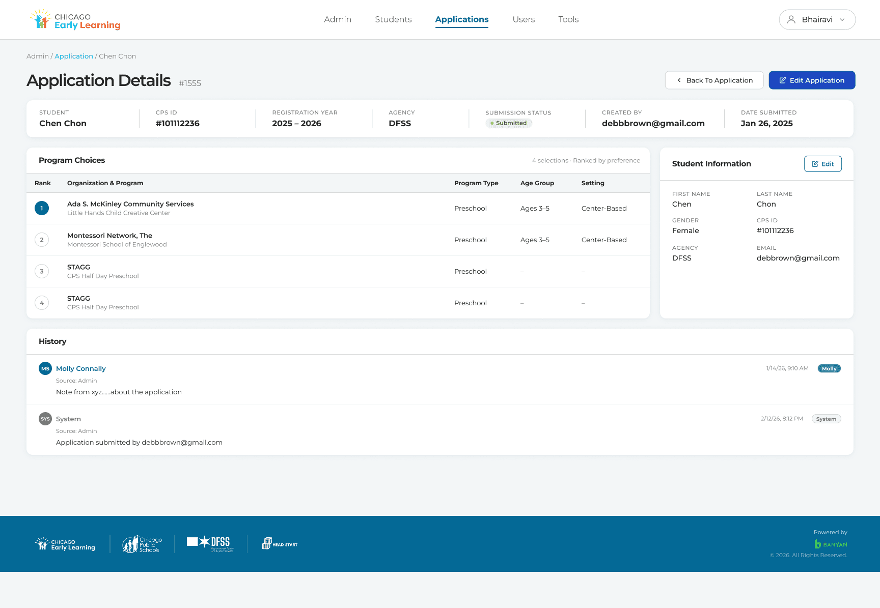
This screen provides a detailed view of a student’s application, enabling the admin to monitor progress, make edits, and track status

Detailed view of the student’s application selections and their final steps
This project had tight constraints and a specific enough client brief, which created both pressure and clarity. While expectations were defined, there was still room to contribute thoughtful suggestions.
Collaborated early with client and engineering to iterate quickly and align on feasibility within existing constraints
Balanced exploration with clarity, provided options without overwhelming or confusing the client
Focused on structured, actionable design decisions rather than over-delivering unnecessary variations
Built and scaled a design system to ensure consistency in components, interactions, and also focused on the language on each page.
Key Learnings
Open to design conversations and new opportunities!
Search Application Page

Detailed Application Page

Detailed Application Page
Proposed Improvements
Proposed Improvements
The original platform had no shared component library. Every screen had independently styled elements. We built this system to give developers a single source of truth and prevent inconsistency from returning as the product grows.
The Navigation Bar and Footer


Button System


Status System


Inputs and Controls


Data Table

Final Screens
Final Product Experience
These are the final screens, developed following the design system and insights from the heuristic evaluation.
Overview of the super admin interface
View of all applications with details
This screen provides a detailed view of a student’s application, enabling the admin to monitor progress, make edits, and track status
Detailed view of the student’s application selections and their final steps
This project had tight constraints and a specific enough client brief, which created both pressure and clarity. While expectations were defined, there was still room to contribute thoughtful suggestions.
Collaborated early with client and engineering to iterate quickly and align on feasibility within existing constraints
Balanced exploration with clarity, provided options without overwhelming or confusing the client
Focused on structured, actionable design decisions rather than over-delivering unnecessary variations
Built and scaled a design system to ensure consistency in components, interactions, and also focused on the language on each page.
Key Learnings
Open to design conversations and new opportunities!